
Match the Foil to the Product's Market Position
Foil shade should support the product price point and the message on the pack. A luxury candle box in Sandton may call for a restrained brushed gold, while a craft chocolate sleeve in Roodepoort might look better with copper or soft champagne. A bright mirror foil can feel energetic, but it can also overpower a sober product range if you use too much of it.
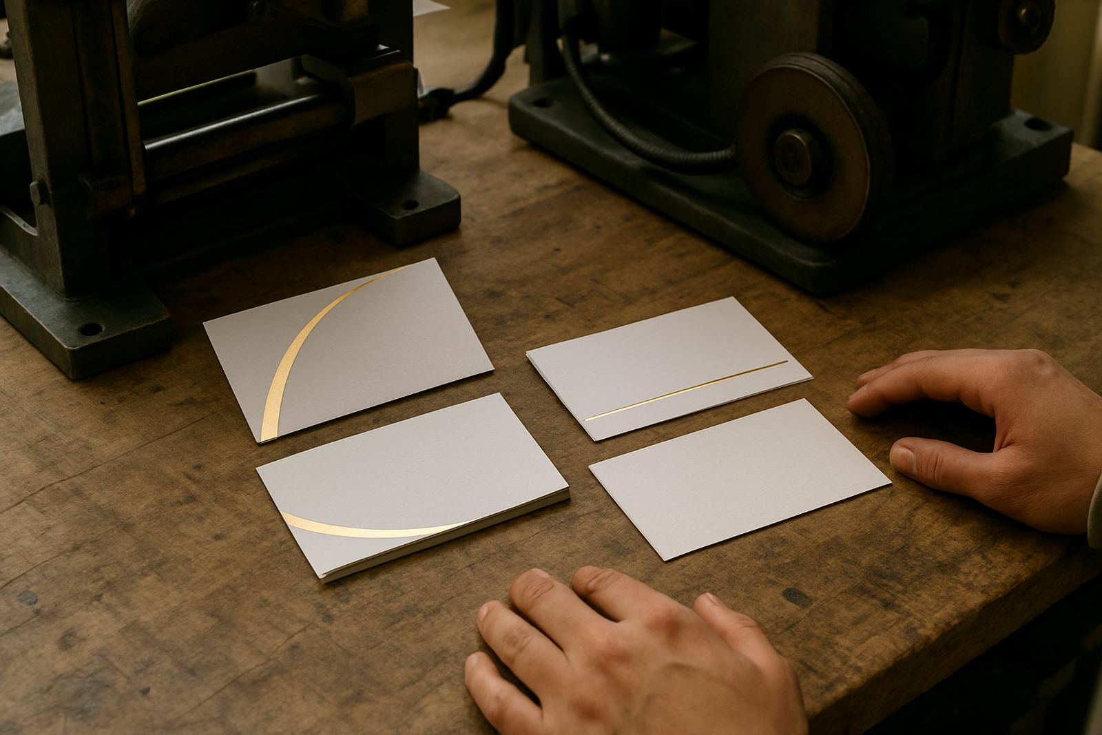
For business cards, presentation folders, and short-run invitation work, the foil colour should help the brand name stand out first. For cartons and sleeves, the foil must also cope with handling, shelf light, and transport. A finish that looks strong in the workshop can lose impact under retail lighting if the shade is too subtle.
- Premium goods often suit gold, silver, black foil, or muted metallics.
- Fun or seasonal products can use vivid colours, two-tone effects, or holographic finishes.
- Industrial packaging often needs high contrast and clear legibility more than decoration.
- When the product travels by courier, avoid ultra pale foils that disappear on camera or in low light.
Use Contrast to Protect Readability
Foil colour must help the eye find the important message quickly. If the wording is too close in tone to the stock, the result can feel weak even when the stamping is neat. Dark gold on brown stock, for example, may be elegant but still hard to read from a metre away. On packaging, that matters when a customer is standing in a store aisle or opening a parcel at home.
Good contrast is especially important for regulatory text, batch details, and brand marks that must stay clear after handling. While foil is often used for decoration, it can also support hierarchy. Use one foil shade for the logo and a different printed colour for the product details, or keep the foil to a small area and let the rest of the pack carry the information.
- High contrast works best for small lettering and fine line work.
- Matte stocks often show metallic foil better than glossy stocks.
- Soft colours such as champagne and pale silver need careful testing on coloured board.
- Strong contrast helps with photography, online sales, and shelf visibility.
Consider Climate, Handling, and Finish Behaviour
South African conditions can change how foil presents on the final pack. In Gauteng, dry winter air and load-shedding interruptions can affect workflow timing, while coastal humidity can influence stock behaviour and how cleanly the foil sits on the surface. If the packaging will move from a workshop in Industria West to a client in Durban or Gqeberha, the foil should be tested for both appearance and stability.
Some shades show fingerprints, scuffing, or press marks more easily than others. Very dark metallic foils can be striking, but they may show scratches more clearly during packing and distribution. Lighter foils can hide handling marks better, though they sometimes need stronger coverage to look complete.
- Hot, dry rooms may require closer pressure and heater checks before production starts.
- Textured or rough stocks may need bolder foil shades for even visibility.
- Glossy packs can reflect light strongly, so test the foil under the lighting used in packing and photography.
- For coastal deliveries, ask how the foil behaves after storage in humid conditions.
Build a Practical Foil Range for Repeat Jobs
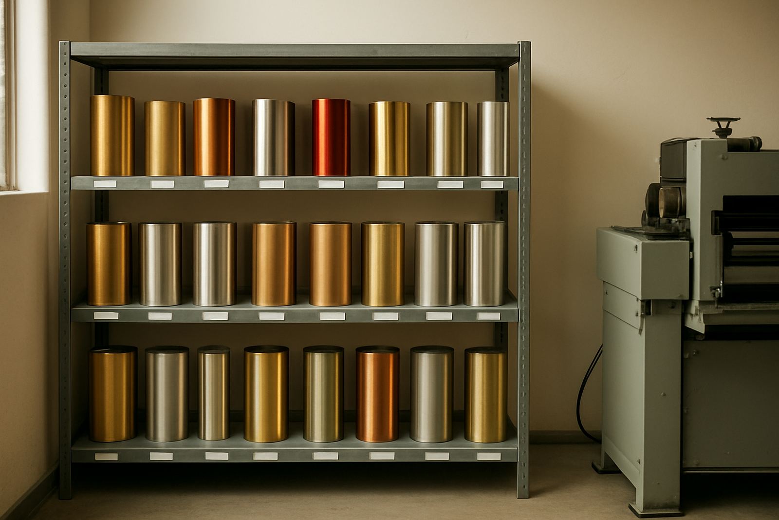
Most packaging producers do better with a small, well chosen foil range than with too many shades. A dependable set makes quoting faster and keeps reorders consistent across seasons. If your work includes cartons, labels, tags, cartons inserts, and gift packaging, choose foils that cover both premium and everyday jobs. That way you can keep production moving without scrambling for a different shade every week.
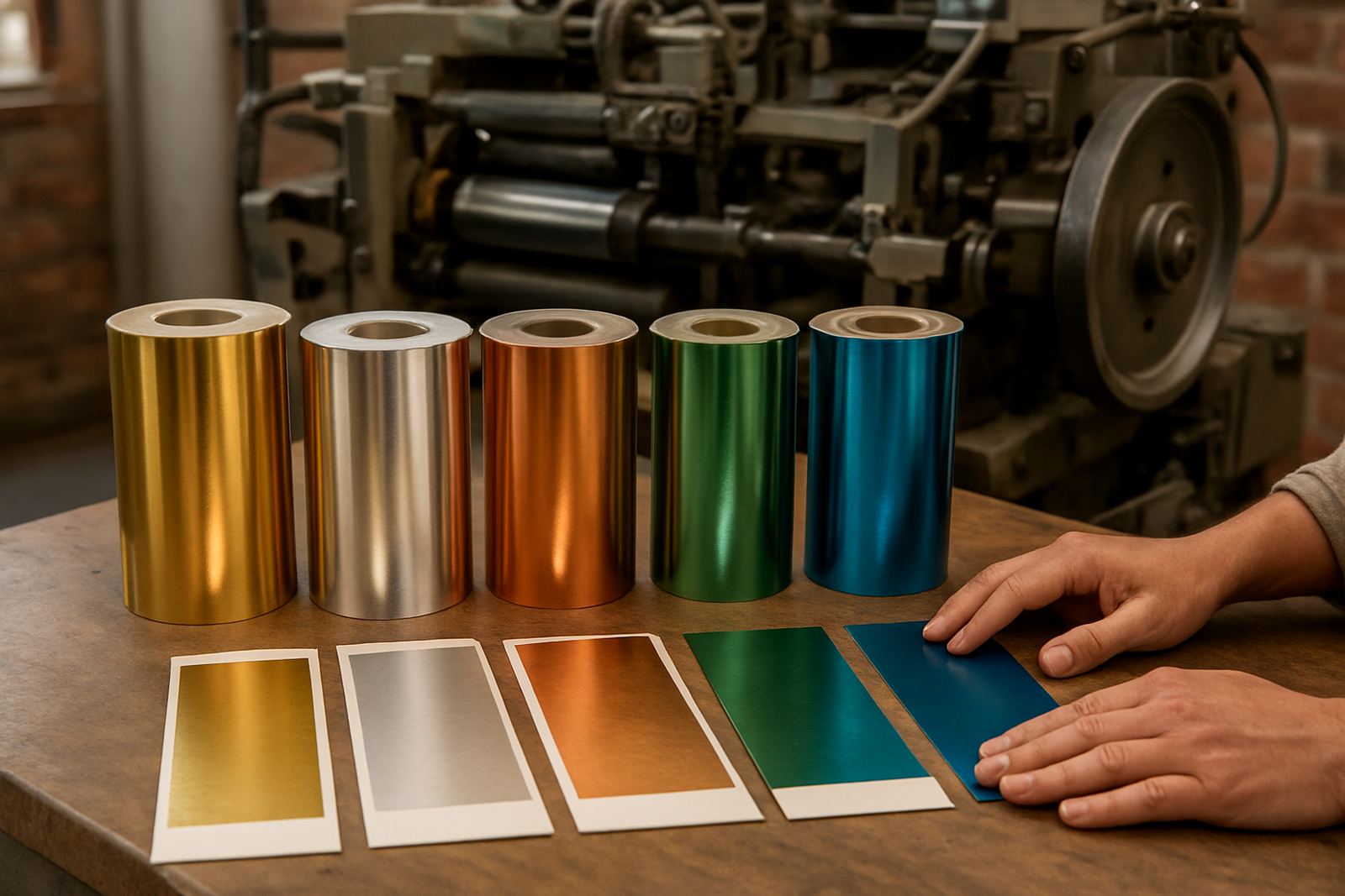
A common setup in Johannesburg City West might include one warm gold, one cooler silver, one copper, one black, and one accent colour for seasonal work. That range gives enough flexibility for most card and packaging work while keeping stock control manageable. It also makes it easier for the production team to match shade expectations from one batch to the next.
- Keep a sample board of all regular foils against white, black, kraft, and coloured stock.
- Label each sample with press settings, stock type, and job date.
- Review which shades move fastest before buying larger quantities.
- Separate everyday foils from short-run decorative foils to reduce waste.
Test Before Full Production in Real Press Conditions
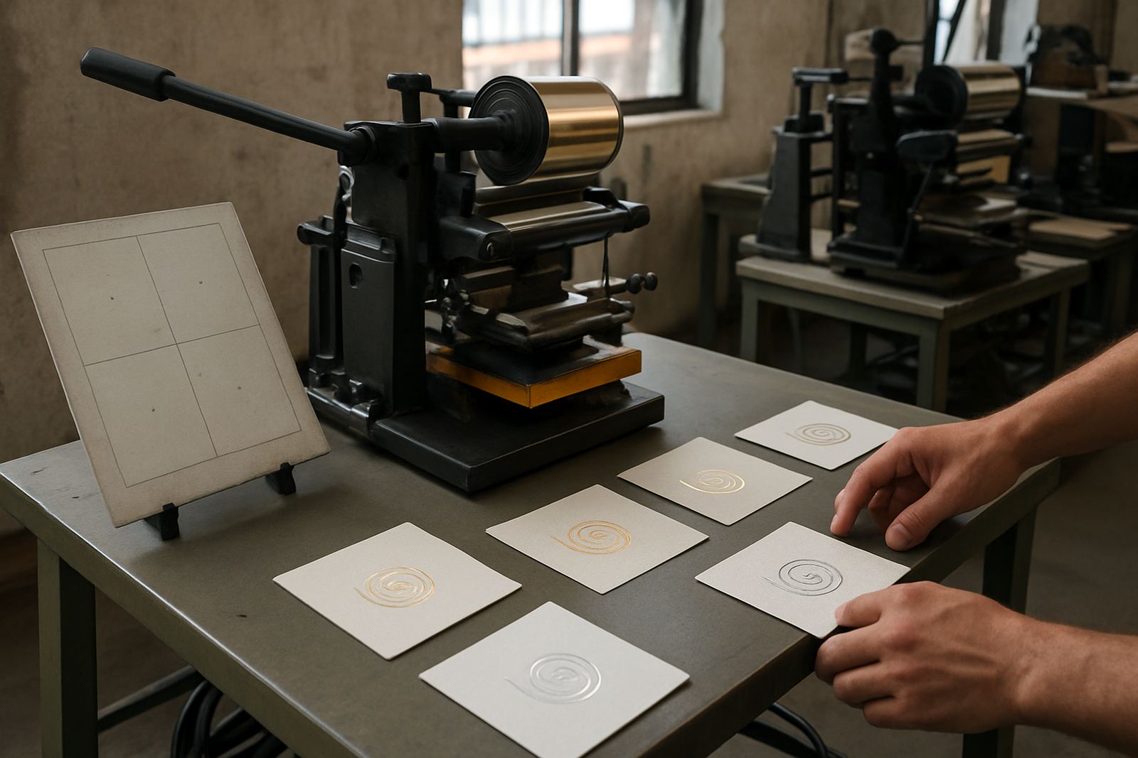
A foil that looks right in the sample book may behave differently under real press conditions. Pressure, dwell time, temperature, die size, and stock finish all affect the final result. If the job uses a new stock or a new shade, run a short test strip before you commit to the full batch. That small step can save a lot of spoilage and rework.
At FoilPress, many clients bring in packaging samples from Randburg, Midrand, Germiston, and Sandton for testing before they place a larger order. This is especially useful when a brand is launching a new range and wants the foil to match printed artwork, labels, and carton colours. A quick test can show whether the chosen foil is too bright, too dull, or too close to the stock tone.
- Check the test under natural light and workshop light.
- Compare the foil against printed ink, not only against blank stock.
- Test the exact stock lot because shade variation can change the result.
- Confirm how the foil looks after handling, folding, and stacking.
A Simple Way to Choose Better Foil Every Time
If you are unsure where to start, choose based on three questions: does it contrast with the stock, does it suit the product, and does it still look good after handling. That is usually enough to narrow the choice to one or two shades. From there, sample on the actual carton or card before signing off the full run.
For South African packagers, especially those working under tight turnaround times and variable power supply, a practical foil selection process saves both time and money. It also helps keep your branding consistent from a small craft run to a larger manufacturing order. When the shade is right, the rest of the finish follows naturally.
If you need guidance on foil matching, press setup, or testing a shade against a new stock, a proper sample run is the safest step before production.