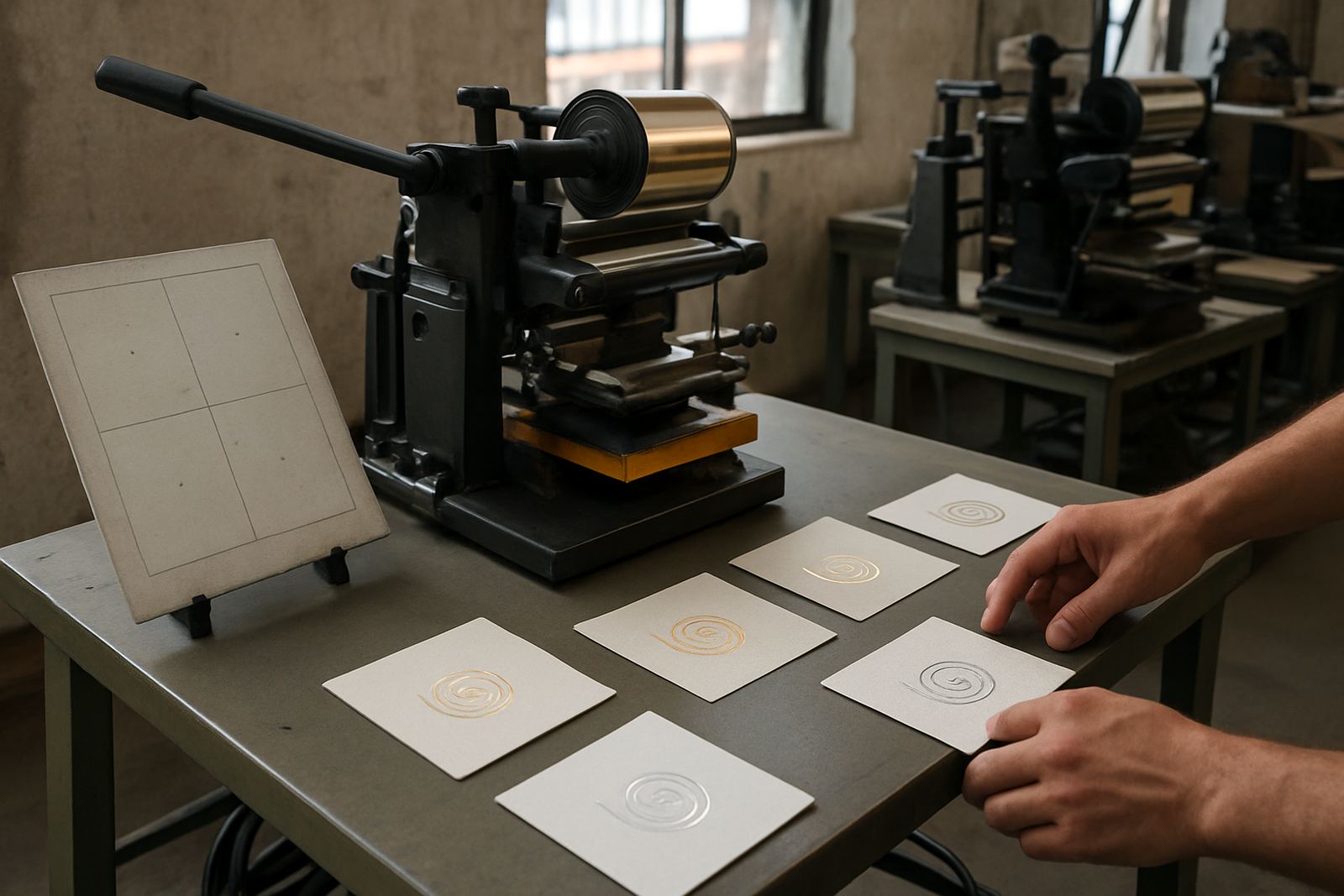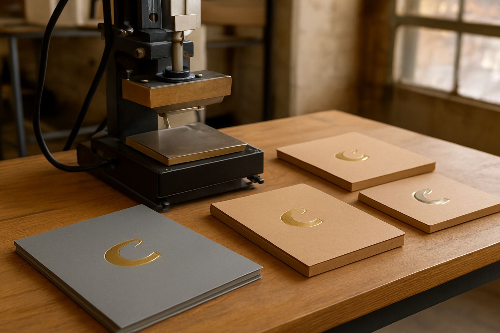

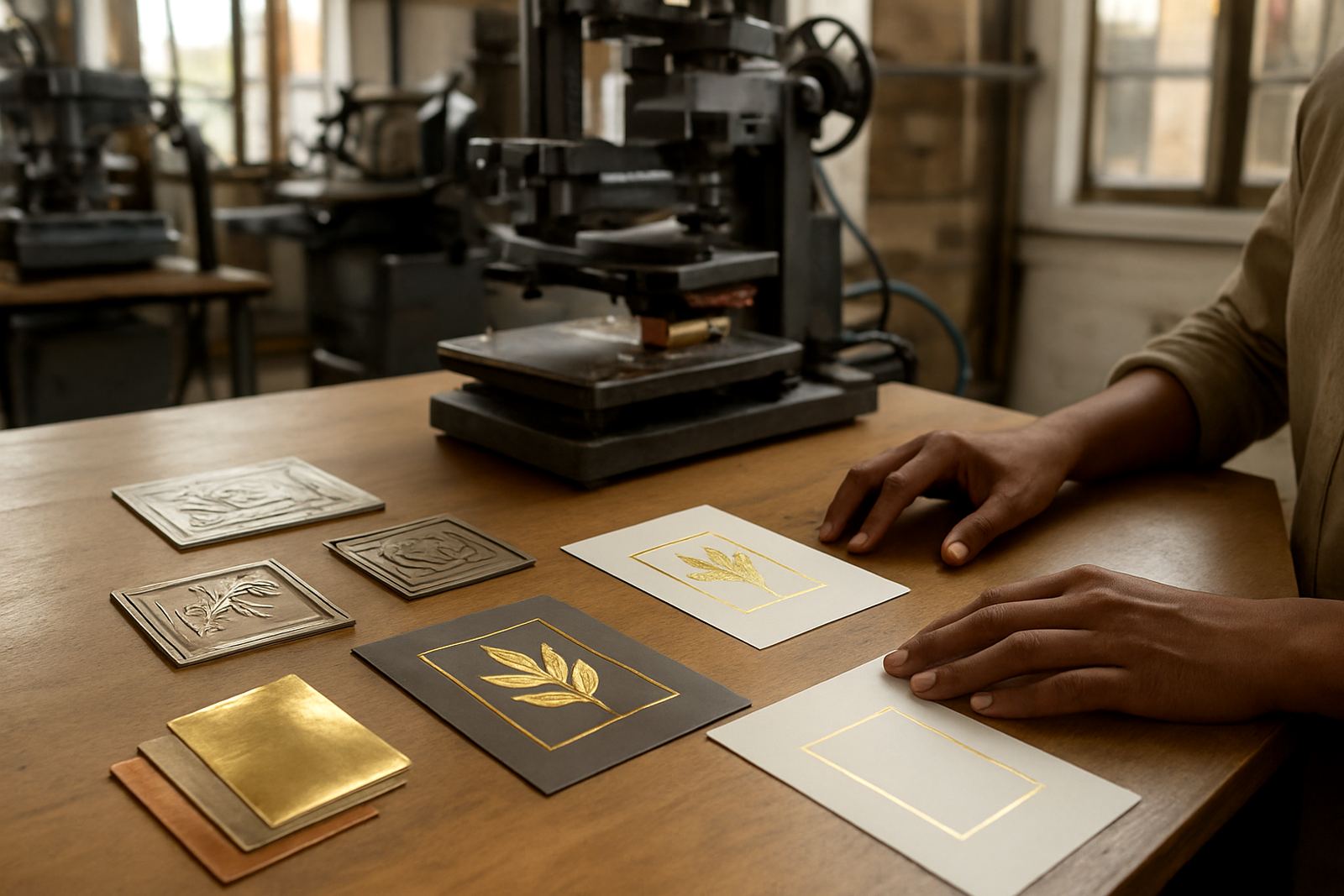
Start with the foil area, not the full design
When artwork is set up for foil stamping, the first question is not what looks nice on screen, but what can print cleanly on press. Solid blocks, fine lines and tight lettering behave very differently once heat, pressure and foil are involved. A logo that looks perfect in flat print may need adjustment before it is ready for a die.
For card and packaging work, keep in mind how the foiled area will sit on the final product. If the artwork is going onto folded cartons, sleeves, tags or presentation boxes, allow for creases, folds and safe margins. In Johannesburg and the surrounding industrial areas, we often see jobs held up because the foil sits too close to a trim line or fold and the finish starts to crack after converting.
- Plan the foil shape first, then build the artwork around it.
- Leave enough room from edges, folds and cut lines.
- Check whether the foil area will sit on flat board or a formed panel.
Line weight and detail: what can actually hold foil
Fine detail can be done, but it must be drawn with the process in mind. Very thin lines, tiny serifs and small gaps can fill in or break once the die heats up. A good rule is to avoid overcomplicating the artwork and keep the strongest elements bold enough to survive the press cycle. If the design is intended for textured board, recycled stock or heavy coated carton, the detail needs even more care.
In practical terms, foil artwork should be built for clarity. If a line is too light, it may disappear. If a gap is too narrow, the foil can bridge across it. If a logo has several tiny interior shapes, those shapes may not release neatly and the result can look muddy. This is why we always advise clients to simplify where needed rather than forcing every detail into the die.
- Avoid hairline strokes for foil stamps.
- Keep small text open and readable at production size.
- Test any fine logo marks before approving the full run.
Spacing matters more than most people think
Spacing is one of the most common causes of disappointing foil results. Letters that sit too close together can blur, while tight artwork around logos and borders can lose definition once the press comes up to temperature. Good spacing helps the die bite cleanly into the stock and gives the foil room to release without smudging at the edges.
This is especially important on packaging jobs that use mixed artwork, such as a logo with a slogan, border lines and a date. Each element needs breathing space. If the design is crowded, the foil can start to look heavy instead of premium. A careful layout also makes future reorders easier, because the same die and setup will behave more predictably across batches.
- Leave clear gaps between separate foil elements.
- Do not crowd small text under logos or along borders.
- Allow extra space for textured board and uneven stock.
Coverage shape and solid areas need press sense
Large solid foiled areas can look impressive, but they also place more demand on the press, the die and the board. A full block of foil needs even pressure across the whole area, otherwise the finish can patch, dull or show tiny misses. That is why coverage shape must be judged alongside the press size and the stock being used. A clean outline or framed panel is often easier to control than a heavy solid block.
For many South African packaging jobs, especially where production runs are repeated, a smart foil shape saves time and waste. Curved corners, open centres and broken fills often transfer better than wide closed areas. On warmer days in Gauteng, and during load-shedding recoveries when the workshop is catching up on schedule, even heat balance becomes more important. A well planned artwork shape reduces the chance of stop-start production and helps keep the batch consistent.
- Use solid blocks only where the stock and press can support them.
- Consider outlines, panels and partial fills for better release.
- Ask whether the design needs a full fill or just a strong accent.
File setup that helps the die maker and the press team
Foil artwork should be prepared with clean separation between foil and non-foil elements. That makes the die making process simpler and reduces the risk of confusion on the floor. Keep foil areas on their own layer or in a clearly marked spot colour, and make sure the artwork is supplied at final size. Resizing after approval can change line weights and spacing, which can throw off the result.
It also helps to send clear notes with the job. If a foil area needs to match a carton window, a sleeve fold or another print colour, say so upfront. In places like Roodepoort, Randburg and Midrand, where many jobs move quickly between design, print and finishing teams, clear instruction saves time and fewer call-backs. It is the small details that keep the press moving.
- Supply foil areas in a clearly marked colour or layer.
- Keep the artwork at final production size.
- Add notes for folds, trims, registration and any problem areas.
A Johannesburg example: a small box job with a tricky logo
A client in Industria West recently brought through a carton label job for premium gift boxes going to Sandton and Germiston retailers. The logo had very thin script, a tight border and a large filled emblem in the centre. On screen it looked fine, but for foil stamping it was too crowded. The border sat too close to the edge and the script had weak joins that would likely close up on press.
We adjusted the artwork by opening the spacing in the lettering, thinning down the border and simplifying the centre fill so the finish could hold properly on the carton board. The result was a cleaner shine, faster make-ready and fewer rejects on the first run. That is the point of proper foil prep: not to change the brand, but to make the artwork work with the material and the machine.
For small businesses in City West, or larger manufacturers working across Johannesburg and nationwide, good foil artwork prep is one of the easiest ways to protect print quality and control waste. It saves board, foil and time, and it gives the final product a neater finish.