
Why dark stock makes foil stand out
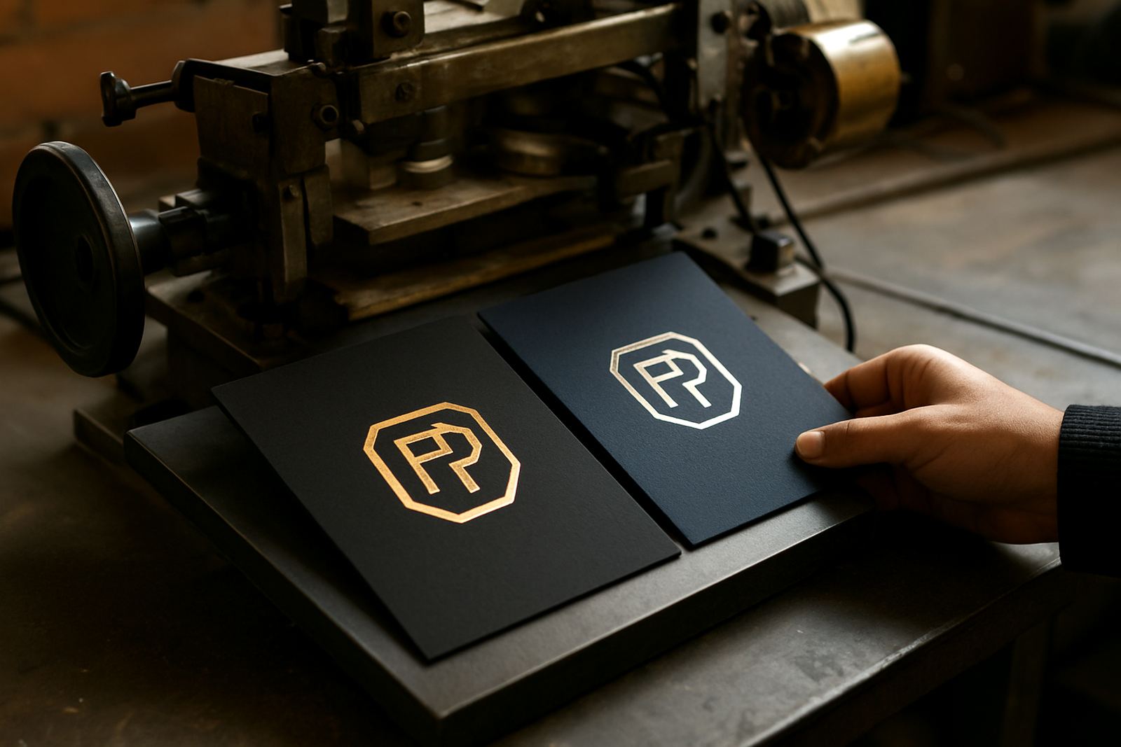
Dark card and coated packaging stock give foil a strong contrast that light stocks cannot match. Gold, silver, copper and holographic finishes show up clearly against black, navy, deep green and charcoal, which is why many card makers and packaging printers use dark substrates for premium work.
The effect looks simple on the shelf, but the press setup behind it is not. Dark stocks can hide small flaws less than pale stocks do, so any uneven transfer, tiny breakout or dull patch is easier to see. That means the press must deliver even heat across the die, steady pressure across the sheet and the right dwell time for the foil film being used. A clean result starts with a clean substrate too, especially on boards that carry a light dusting from cutting or creasing.
Getting heat and pressure in the right range
On dark stock, the first instinct is often to add more heat or more pressure. That can help for a short run, but too much of either can cause the foil to spread, crush the fibres or leave an outline around the image. The better approach is to find the lowest setting that gives full transfer and edge definition.
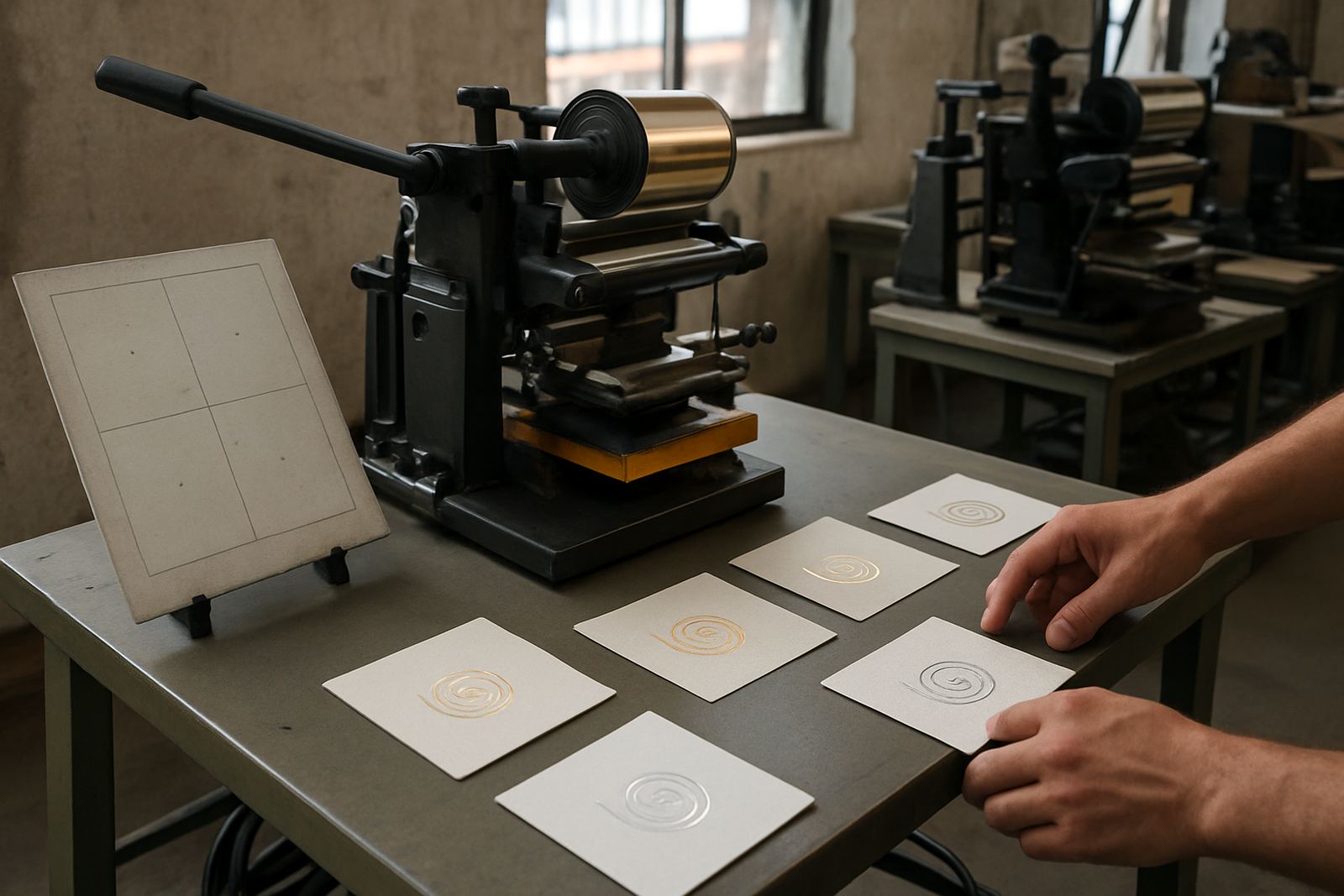
For most card and packaging work, operators should test at a few temperature steps and keep notes on the exact stock, foil type and humidity on the day. Johannesburg winter mornings can be dry and cool, while summer afternoons in Industria West can be warm enough to change how the release layer behaves. Small changes matter. A set up that works on 300 gsm black board in Randburg may need a small adjustment when the same job is run on a heavier, coated stock in Midrand.
- Start with a short test run before committing to full sheets.
- Check that the die face heats evenly from corner to corner.
- Adjust pressure before raising heat too far.
- Record the settings for repeat orders.
Stock choice affects the final shine
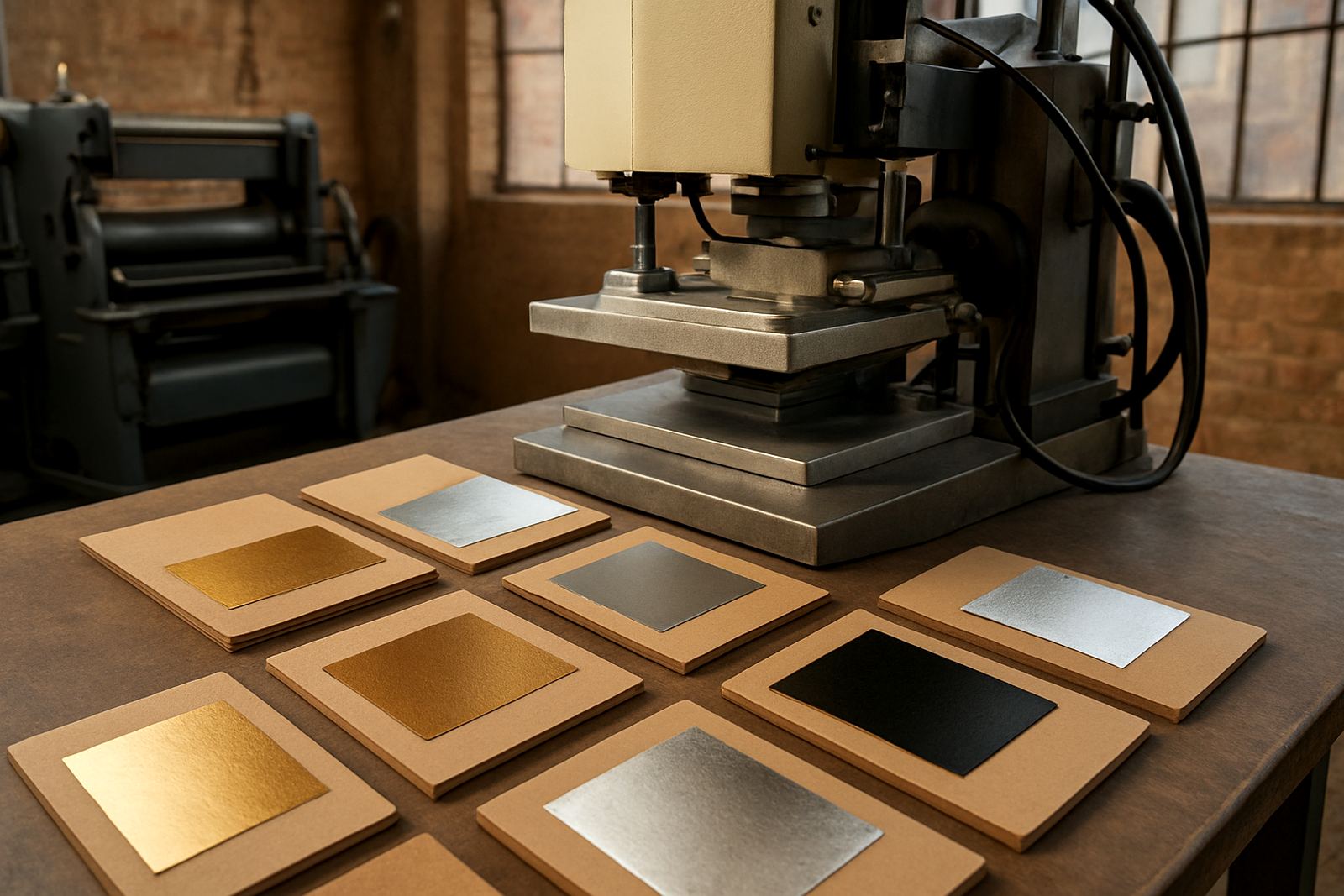
Not every dark stock behaves the same. Uncoated boards absorb heat more quickly and can give a softer, warmer impression, while coated stocks often need more careful timing because the surface releases differently. Textured stock can look striking, but fine detail may need a sharper die and tighter pressure control.
Packaging suppliers often bring in dark material for cartons, sleeve wraps and presentation boxes, but the board must still suit the product. Thin stock can warp if the press is too hot, while very rigid board may need more dwell time to get a clean pull. In Gauteng we see a lot of jobs where the print finish is ready, but the board choice is what decides whether the foil looks crisp or patchy. It is worth matching the substrate to the image, not the other way round.
Die mounting and foil matching on difficult colours
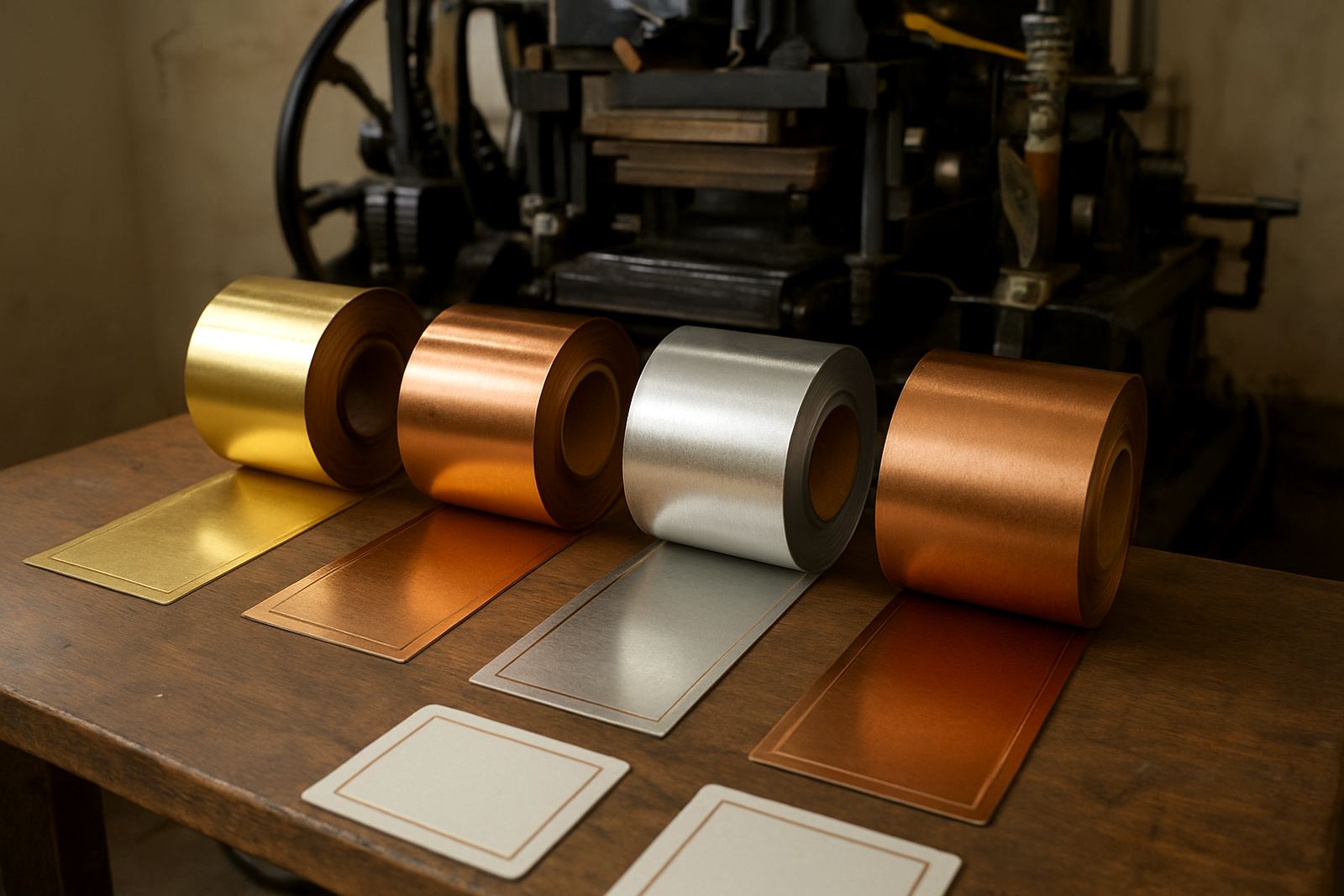
When the stock is dark, the quality of the edge line becomes more obvious. A die that is not mounted flat can leave a shadow, a light spot or a faint double image. Careful mounting helps prevent wasted foil and reduces the need for rework. The same goes for foil matching. Some foils carry a bright shine, while others are more muted and suit deep coloured board better.
For logos, fine text and packaging codes, the choice of foil finish should follow the artwork and the viewing distance. A highly reflective finish can be excellent for gift packaging, while a softer metallic may suit cosmetic sleeves or premium stationery. The best results come from testing a small area first, then confirming the foil under normal shop lighting and natural light. What looks right under workshop lights may read differently in a retail space.
- Use a mounted die that sits flat and secure.
- Keep foil rolls clean and dry before loading.
- Test both bright and soft metallic options on sample stock.
- Check the result under indoor and daylight conditions.
Local conditions in Johannesburg can shift the result
Foil work in City West is affected by the same everyday conditions that affect other production lines. Load-shedding can interrupt pre-heating and cool a machine at the wrong moment. Dust from nearby industrial activity can settle on stock and create small specks on the finished foil. Summer humidity can alter how foil releases, while dry weather can increase static on some card grades.
That is why many shops in Industria West, Roodepoort and Sandton keep a regular servicing routine in place instead of waiting for a problem. Heater calibration, pressure setup and preventive servicing help keep results consistent when orders move quickly from one paper batch to the next. For businesses working to municipal deadlines or trade show cut-offs, consistency matters more than chasing a slightly shinier sample. One bad run can cost a full shift.
A practical setup routine for repeat orders
Once the first sample is approved, the job still needs a method that can be repeated without guesswork. A simple routine keeps the run stable from the first sheet to the last and helps operators catch problems early.
Before starting, confirm the stock batch, die position, foil type and machine settings. During the run, check the first few pulls and then inspect intervals through the job. If the foil starts to fade at the edges, the problem may be pressure balance or temperature drift rather than the foil itself. If the image shows smudging or picking, the stock may be too hot or the release timing too fast. Good operators learn to read these signs quickly and adjust before spoilage builds up.
- Log stock batch, foil colour and press settings on every repeat order.
- Inspect the first sheets and then sample through the run.
- Keep spare heaters, controls and common parts on hand.
- Schedule servicing before the machine starts drifting out of spec.
What dark-stock foil jobs need from a supplier
Dark stock jobs often move between small craft work and larger manufacturing runs, so support has to be practical. That means help with installation, operator training, breakdown repairs, heater calibration, die mounting and spares when something wears out. It also means advice on production optimisation, because the difference between a good-looking sample and a profitable production run is often setup discipline.
For businesses in Johannesburg and across South Africa, the goal is not just to make foil shine, it is to make it repeat. When heat pressure and stock choice are matched well, dark boards can carry metallic accents with excellent clarity. When they are not, the same job can chew through time and foil very quickly. Getting that balance right is what makes the finish worth the effort.
Why the finish matters on shelf and in hand
Foil on dark stock is often chosen for presentation boxes, greeting cards, certificate covers and premium packaging because the contrast reads well at a glance. It also adds a tactile element. When the impression is crisp, the raised or flat foil detail gives the product a proper finished feel, not just a printed look.
That is especially useful for businesses selling into retail, events or corporate gifting, where the customer may only spend a few seconds looking at the item. A dark base with a clean metallic finish can do a lot of visual work without adding more print colours. The trick is keeping the process controlled from the start. A clean press, the right die, proper heater calibration and steady pressure are what turn dark stock into a reliable foil surface.