
Why the foil finish changes the whole pack mood
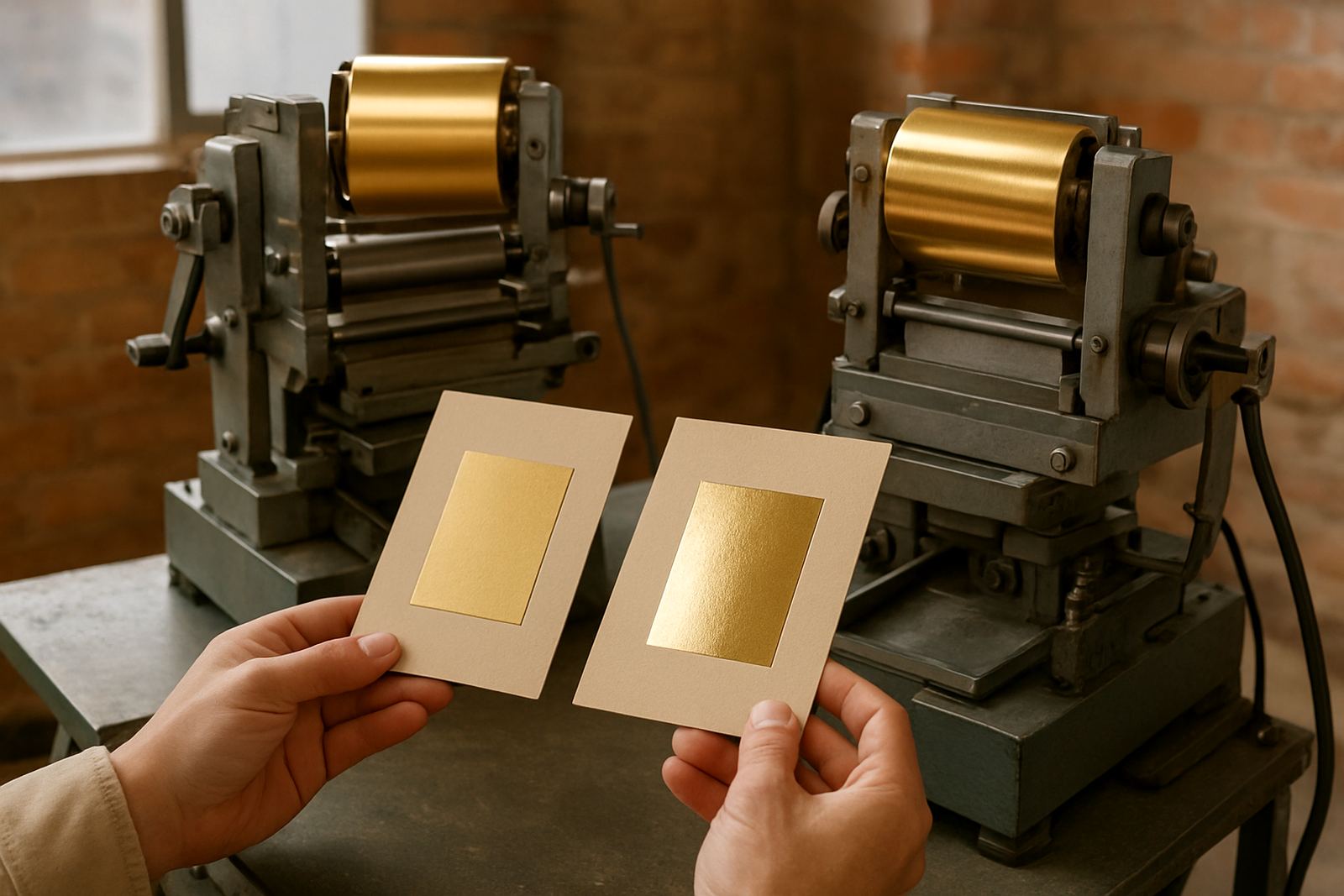
Matte foil gives a muted, low-shine look that feels restrained and premium. Gloss foil reflects more light, so the same logo or border can read louder and sharper, especially under shop lights or in photos.
That difference matters when you are working on presentation boxes, invitation cards, wine sleeves, cosmetic cartons or short-run packaging for events. A matte mark usually feels calm and considered, while gloss feels more direct and eye catching. Neither is better in every case, because the finish has to match the product story and the way the pack will be handled.
In Johannesburg and the surrounding industrial areas, many converters want a finish that still looks good after stacking, courier transport and warehouse handling. If a pack must carry shelf appeal and a sense of quality, the foil choice should be treated like part of the design brief, not just a final decoration.
When matte foil works better
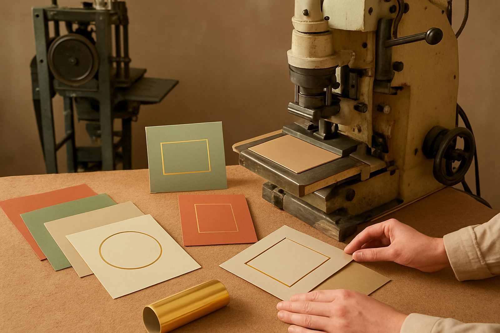
Matte foil is often the stronger choice when the base artwork already has plenty of colour, texture or type. It does not fight for attention, so it can give the pack a more grown-up look. On kraft board, textured stock and natural-looking carton materials, matte foil usually sits comfortably and feels intentional.
It is also useful where the customer wants a soft, tactile feel rather than a flashy shine. Luxury candles, artisan food packs, gift cartons and stationery sets often benefit from that quieter finish. If the design uses fine lettering, matte can help keep the visual message steady instead of turning the whole mark into a reflection.
- Good for understated premium packs
- Works well on textured or uncoated board
- Often suits natural, earthy colour palettes
- Can help detailed type look calmer on press
Matte foils can be more forgiving when a brand wants elegance without looking overdone. That said, the press setup still has to be right. Poor pressure, wrong temperature or an uneven die can flatten the effect and leave the finish looking patchy, especially on thicker board.
When gloss foil gives stronger shelf impact
Gloss foil is the better option when visibility matters. It catches light quickly, so logos, borders and key words can stand out from several metres away. For retail packaging, that extra reflection can help a product pop on a crowded shelf or on a display table at a market.
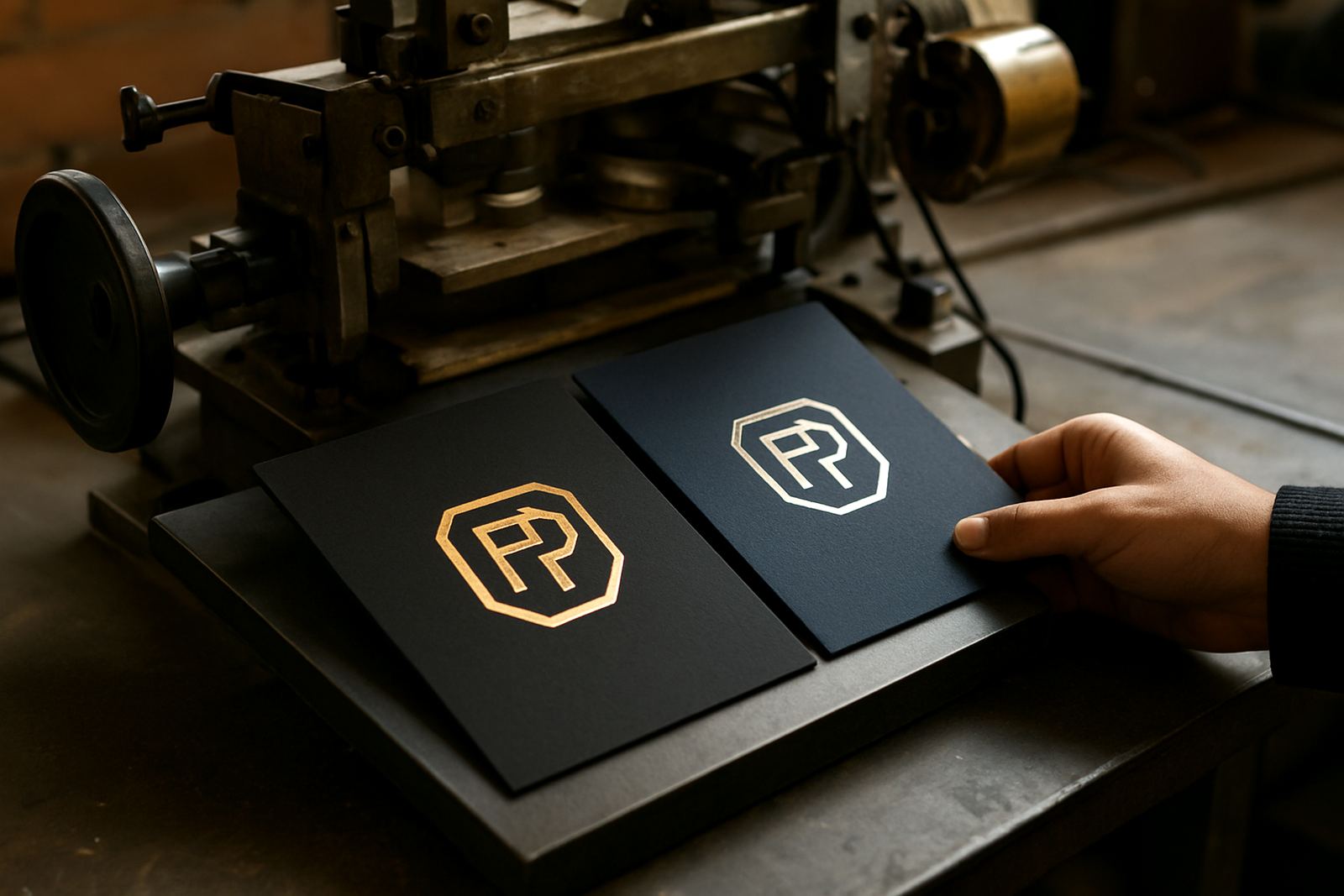
Gloss also suits bolder design work. If the pack has dark solid backgrounds, bright accents or sharp geometric layouts, the reflective surface adds contrast. It can also help create a cleaner, sharper impression on smoother stocks, where the foil sits neatly and looks crisp under consistent heat and pressure.
- Useful for retail packs that need quick visual impact
- Strong on smooth carton and coated stock
- Works well with dark backgrounds
- Can make small logos easier to notice
For businesses selling into malls, expos or gift stores in Sandton, Midrand and Randburg, gloss can do a lot of work without adding extra print colours. The key is not to overuse it. Too much shine across a whole pack can make the design feel busy, so many printers reserve gloss foil for the logo, product name or border detail only.
Stock, pressure and heat decide how each finish behaves
The same foil can behave very differently depending on the substrate. A smooth coated board may give a very sharp gloss result, while a softer or more absorbent stock can mute the reflection and turn gloss into a softer shine. Matte foil often shows its best character on boards with a little tooth, where the finish looks balanced and less mirror-like.
Pressure setup, heater calibration and die mounting make a big difference too. If the heat is too low, the transfer may look weak. If the pressure is too high, the foil can edge out or mark the board. South African workshops also have to consider load-shedding, because temperature recovery after an outage can change the run if the machine is brought back too quickly.
On hot days in Johannesburg or in more humid coastal shipments going out later, the material can also behave slightly differently. Foil matching before the main run saves time and waste, especially when the pack uses fine lines or small type.
A practical comparison for common packaging jobs
Most businesses do not choose foil by finish alone. They choose it by use case. A bakery carton for a seasonal range, a rigid gift box for corporate orders, and a sample card for a packaging buyer may all need different visual outcomes even if the artwork is similar.
Here is a simple way to think about it:
- Matte foil for quiet luxury, natural stock and softer branding
- Gloss foil for strong shelf presence and sharper contrast
- Matte on textured board when the feel of the stock should stay visible
- Gloss on coated board when the image must stand out fast
- Mixed use when a pack needs both calm and impact, such as matte logo with gloss border
For many South African packaging firms, the best answer is not either-or. It is often one finish for the brand name and another for the accent line, provided the artwork and die detail can support it.
Where local production needs careful foil planning
Foil finishing is not only about looks. Production teams in Industria West, Roodepoort, Germiston and nearby areas need output that is repeatable across batches. When a customer orders 500 sample packs now and 5 000 units later, the finish must still match closely so the brand does not look inconsistent from one delivery to the next.
That is why preventive servicing, breakdown repairs and production optimisation matter. A press that is not holding temperature properly can struggle with both matte and gloss, but the problem is often more visible on gloss because any inconsistency in reflection stands out quickly. Operator training also helps, because small changes in setup can affect foil grab, waste and speed.
In practical terms, the best foil choice is the one that prints cleanly, keeps waste down and suits the customer's real handling conditions. A pack travelling from Johannesburg to Durban in summer should be assessed differently from a short-run hand-finished gift item delivered locally in Sandton.