
1. Start With the Packaging Job, Not Just the Shine
Before you choose a foil colour or pattern, define what the packaging must do on shelf, in transit, and at the point of sale. A cosmetic carton for Sandton retail will need a different finish from a food tray sleeve going through bulk handling in Germiston or a short-run gift box packed by hand in Roodepoort. The best results come from matching the foil to the product, the substrate and the quantity.
Ask three simple questions. Is the pack meant to feel high-end, industrial, festive, or security-focused? Will it be handled often, stored in humid conditions, or packed flat and assembled later? Is the run 500 units or 50 000 units? These answers affect whether you use a bold logo hit, fine text, a full panel accent, or a light border detail. If the finish is too busy the pack can look crowded and become harder to keep consistent.
- Define the retail environment and handling conditions.
- Set the print run size and turnaround time.
- Decide whether the foil is for branding, decoration or product security.
2. Choose Foil Colour and Finish for the Right Market Signal
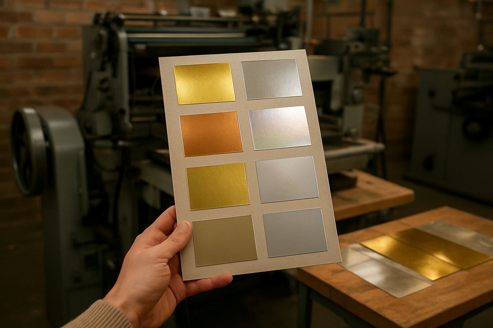
Foil colour carries a strong visual message. Gold still reads as premium for gifting, beauty, spirits and anniversary packaging. Silver often suits technical products, personal care and clean modern labels. Copper, rose tones and matte metallics can give a more crafted look for small businesses that want something less common. Black foil on a dark board can be very effective when the light catches it, especially for premium corporate packs.
Do not choose by colour alone. Finish matters just as much. A bright mirror foil gives strong shelf impact but may show fingerprints during packing. A satin metallic is softer and can hide handling marks better. If the pack is going to coastal areas like Durban or Gqeberha later, consider the storage conditions too because humidity can affect board and adhesive performance. On some jobs a simpler foil choice prints cleaner and saves time in setup.
- Use gold for warmth, prestige and gift appeal.
- Use silver for modern, technical or clean branding.
- Use matte or satin finishes where handling marks are a concern.
- Test colour against the actual board, not only against a white sample.
3. Match the Board, Die and Heat Settings to the Artwork
Good foil depends on proper setup. The board must take impression cleanly without crushing the surface, and the artwork must suit the line weight available. Fine lettering, very thin borders and small detail need accurate temperature, pressure and dwell time. If the heat is too high you can get bleeding or dull edges. If it is too low the foil may lift or patch out. The die also needs to be mounted squarely so the pressure lands evenly across the job.
For packaging buyers, this is where many avoidable problems begin. A carton may look fine in the sample room but fail on the machine because the board is coated differently, or the artwork is too close to the fold. Allow enough quiet zone around folds, scores and cut lines. If the pack has a window, lamination or heavy ink coverage, tell the technical team early so the setup can be adjusted. In Johannesburg production conditions, load-shedding planning also matters because temperature recovery and press timing can shift after power interruptions.
- Keep critical foil detail away from folds and crush lines.
- Use artwork that suits the die size and machine capacity.
- Confirm temperature, pressure and dwell settings before the full run.
- Check whether coating, varnish or lamination will affect adhesion.
4. Use Foil Sparingly Where the Pack Needs to Feel Expensive
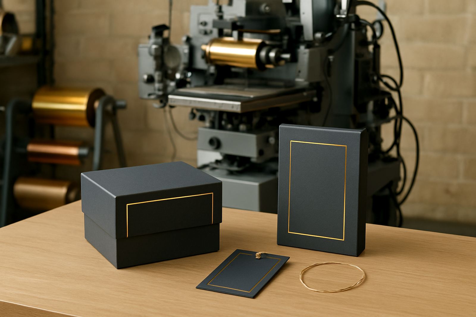
Premium packaging is not always about more coverage. Often the most effective choice is a controlled foil accent placed where the eye naturally lands. A logo on the front panel, a product name on the shoulder, or a small seal near the flap can feel more refined than a full flood effect. This approach also helps with speed, waste and repeatability.
Think about the opening sequence. If the outer carton has a restrained foil mark and the inner insert carries the decorative element, the customer gets a stronger reveal. For subscription boxes, limited edition packs and specialist retail cartons, this layered approach can add value without making the job expensive. For larger manufacturers, a smaller foil area often means better consistency on long runs and fewer stoppages for cleaning and make-ready.
- Place foil where the shopper first looks, usually the front face.
- Keep the design simple for long runs and repeat orders.
- Use interior panels or seals for a second premium moment.
- Reduce coverage if budget, time or storage conditions are tight.
5. Build a Short Pre-Production Checklist Before You Approve the Run
Approval should happen on a real sample, not from a screen mock-up alone. A clean proof gives you a chance to check alignment, colour, depth and legibility. It also helps the packhouse or brand owner catch issues before production starts. In packaging jobs, a small error can mean wasted board, extra labour and delayed delivery to stores in Johannesburg, Midrand or further afield.
Use a simple sign-off process so everyone knows what has been approved. This is especially useful when several people are involved, such as the brand team, the converter and the buyer. Keep a note of the approved board type, foil name, press settings and quantity, so repeat orders can be set up faster. It saves time when the same carton comes back months later and the original sample is already on file.
- Approve on the actual substrate and finish.
- Check registration, legibility and foil edge sharpness.
- Record the exact board, foil and machine settings.
- Confirm carton assembly and packing method before final release.
6. Protect the Finish After Production and During Storage
Foil can look excellent off the press and still disappoint if the cartons are stored badly. Let the job cure where needed and keep it away from dust, damp floors and direct sun. In coastal or high-humidity conditions, packaging should be boxed and stored flat before dispatch. If cartons are stacked too tightly, the impressed areas can mark or scuff, especially on high-shine finishes.
For packers and procurement teams, the practical issues are simple. Allow for air movement, keep boxes off concrete, and avoid rubbing the foil face against rough wrapping. If the job is going into long-term storage, ask for handling notes from the production team. Good aftercare keeps the finish looking sharp and helps the pack land on shelf the way it was intended.
- Store cartons in a dry area away from floor moisture.
- Avoid friction, tight banding and rough outer wrapping.
- Check samples after storage before releasing bulk stock.
- Keep notes for repeat orders and future seasonal runs.